

Mariesa maE
Logo design and branding package for start up lingerie brand
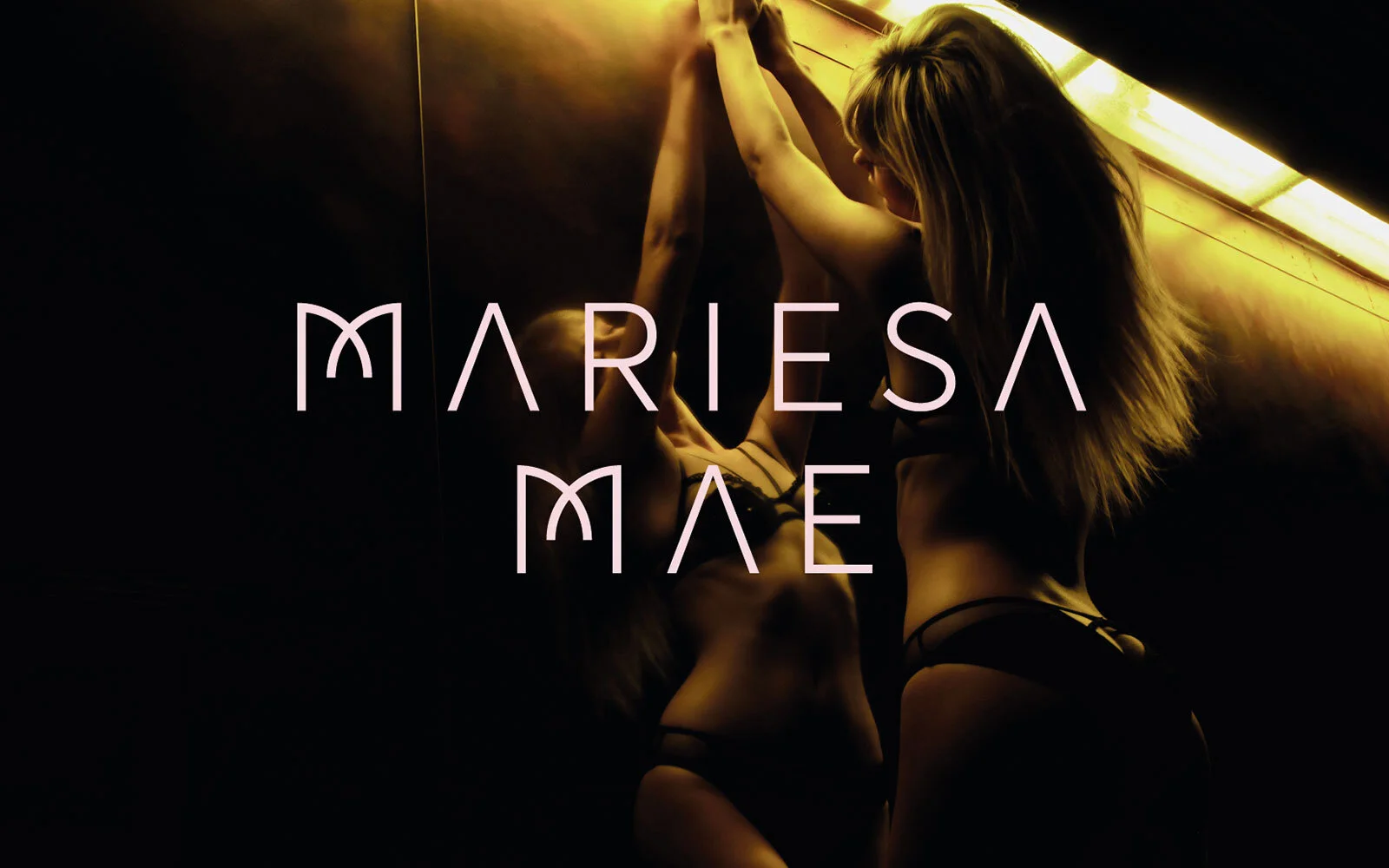
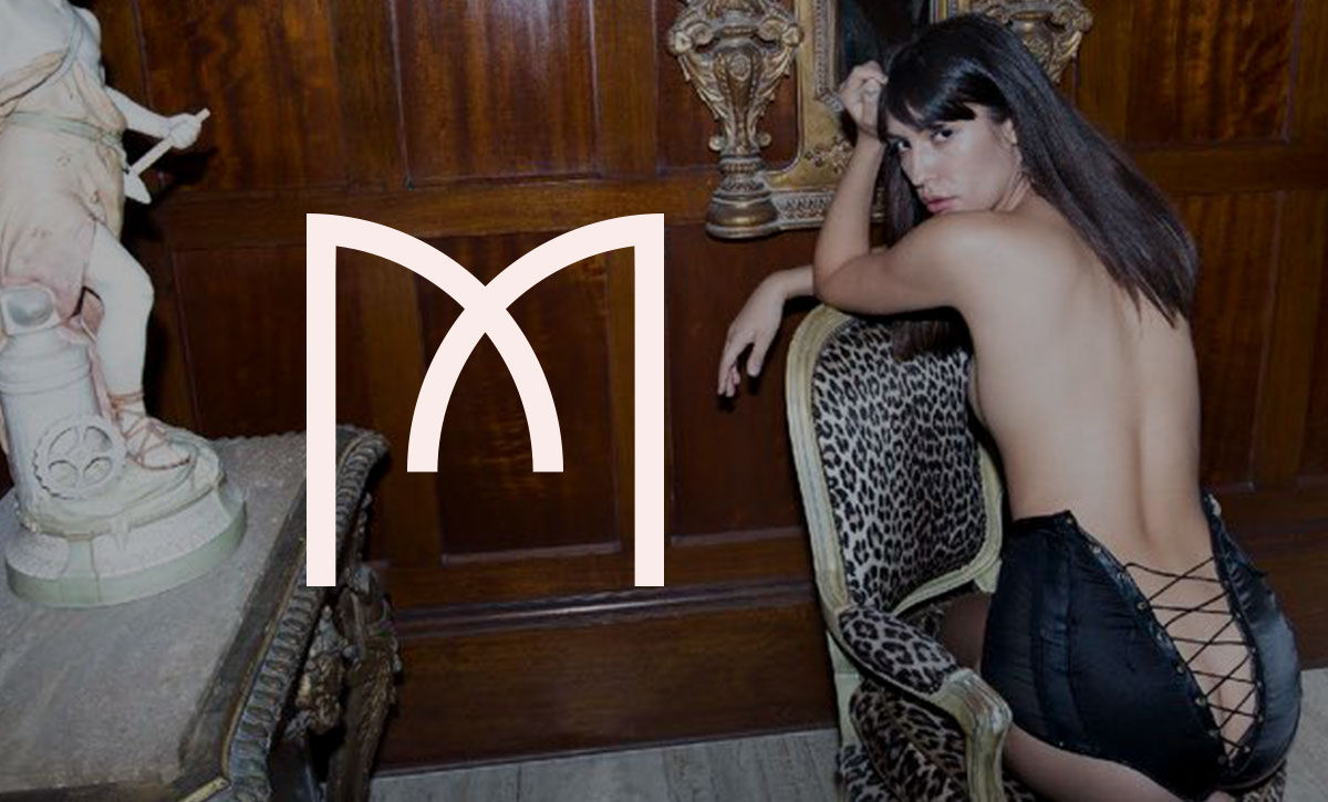
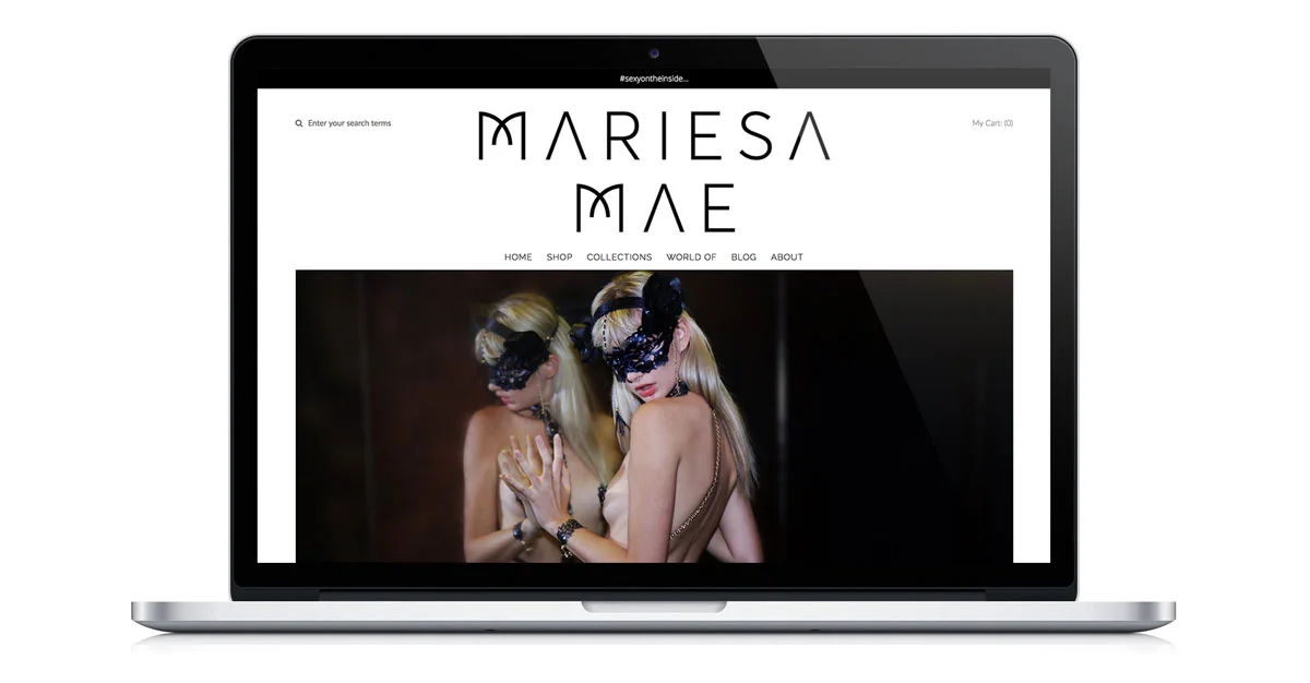
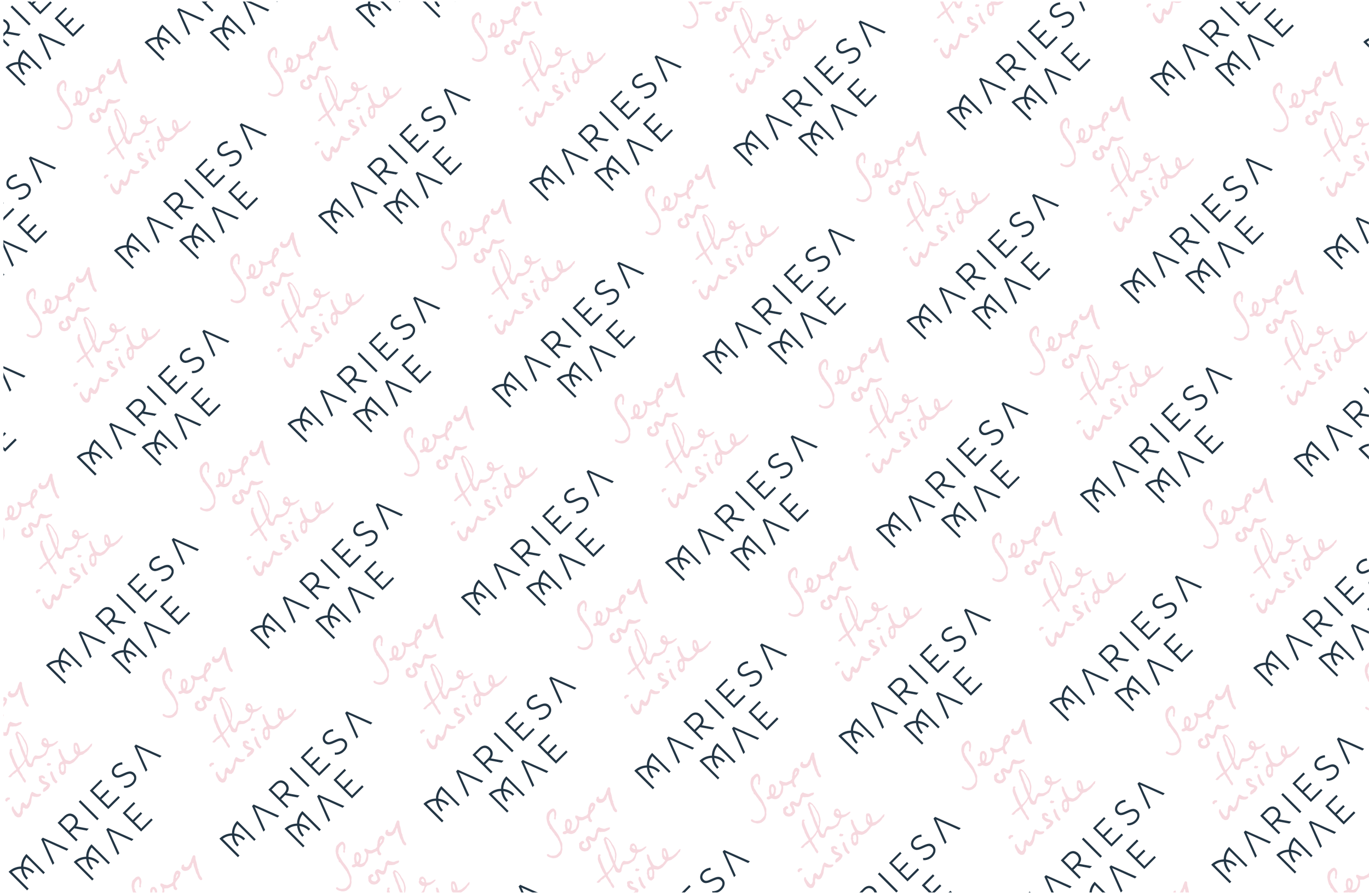
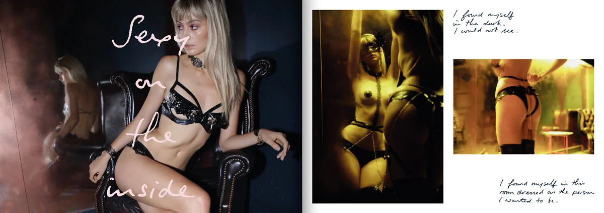
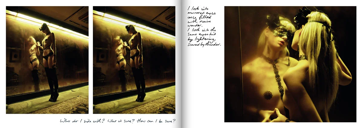
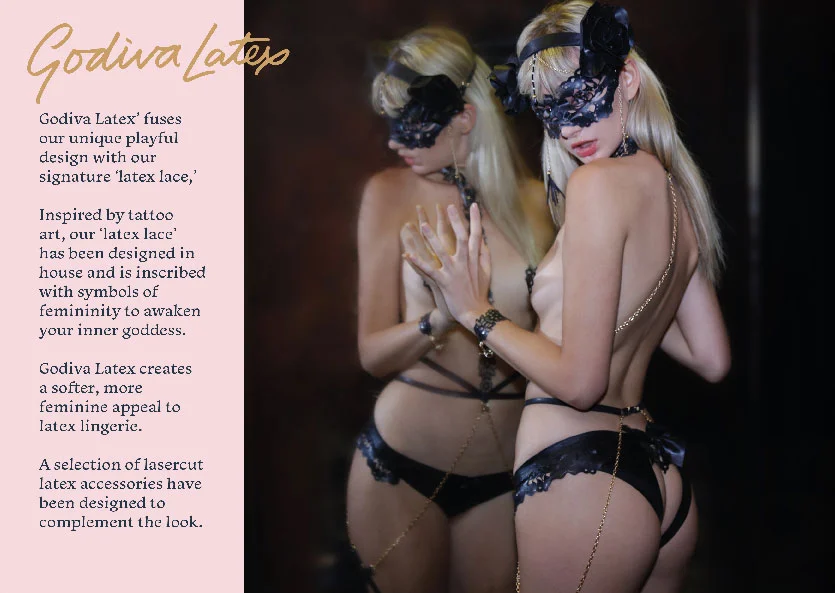
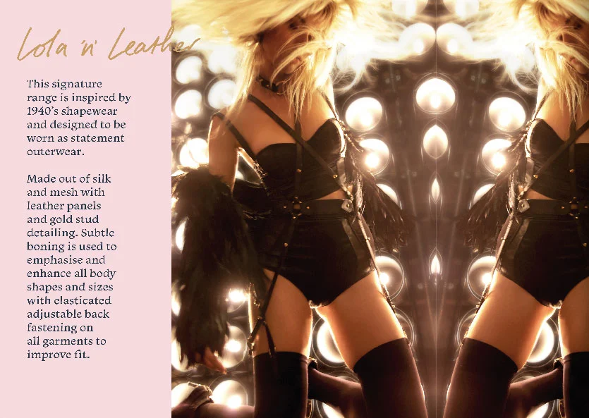
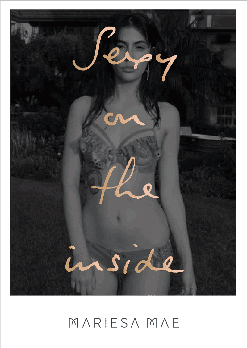
Juxtapositions of style can be a very effective design tool. Thats the approach I took with this logo and branding packing for Mariesa Mae lingerie. The logo itself is an update of an old logo the founder of the brand had created a few years previously, I made the M’s a bit more unique so they could be pulled out and used a a separate brand icon. I then paired this simple, elegant work mark with a hand written slogan that was more energetic in appearance. This handwritten style was then applied to other brand touch points such as packaging and lookbooks