

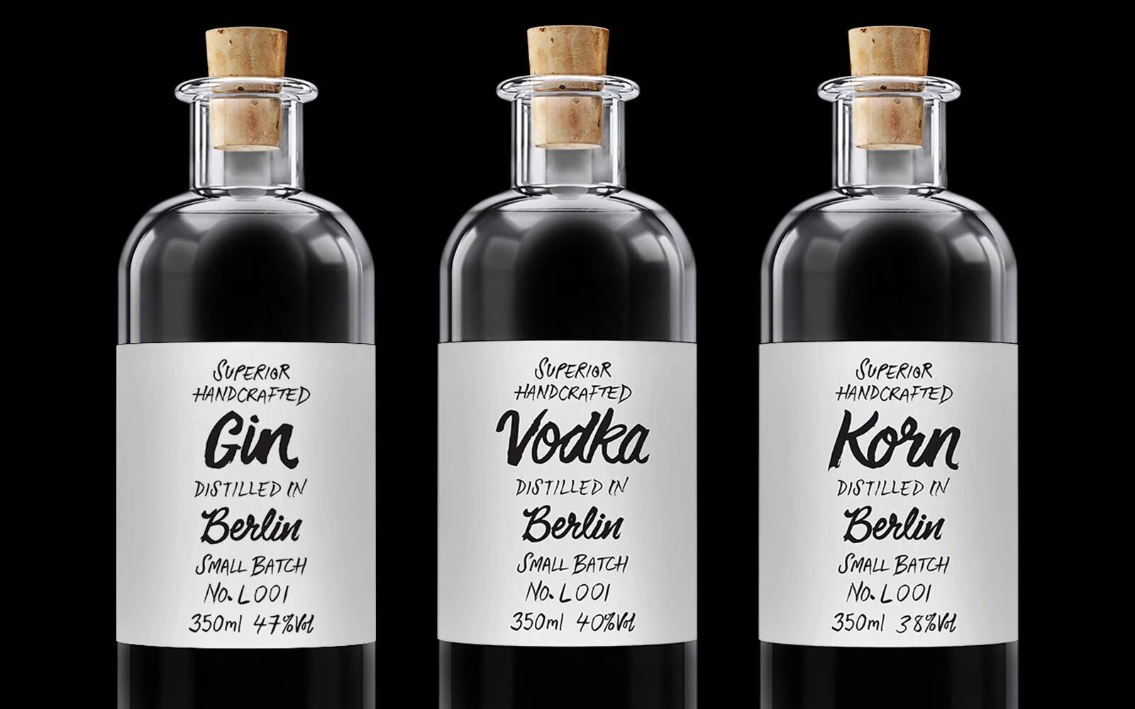
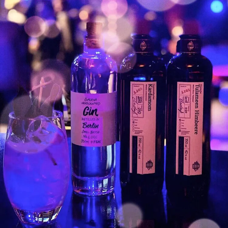
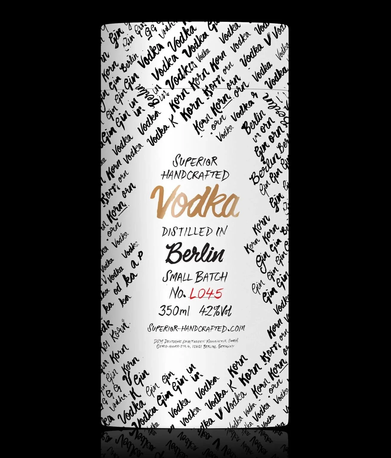
SUPERIOR HANDCRAFTED
hand drawn TYPOGRAPHic treatments for berlin based small batch distillery
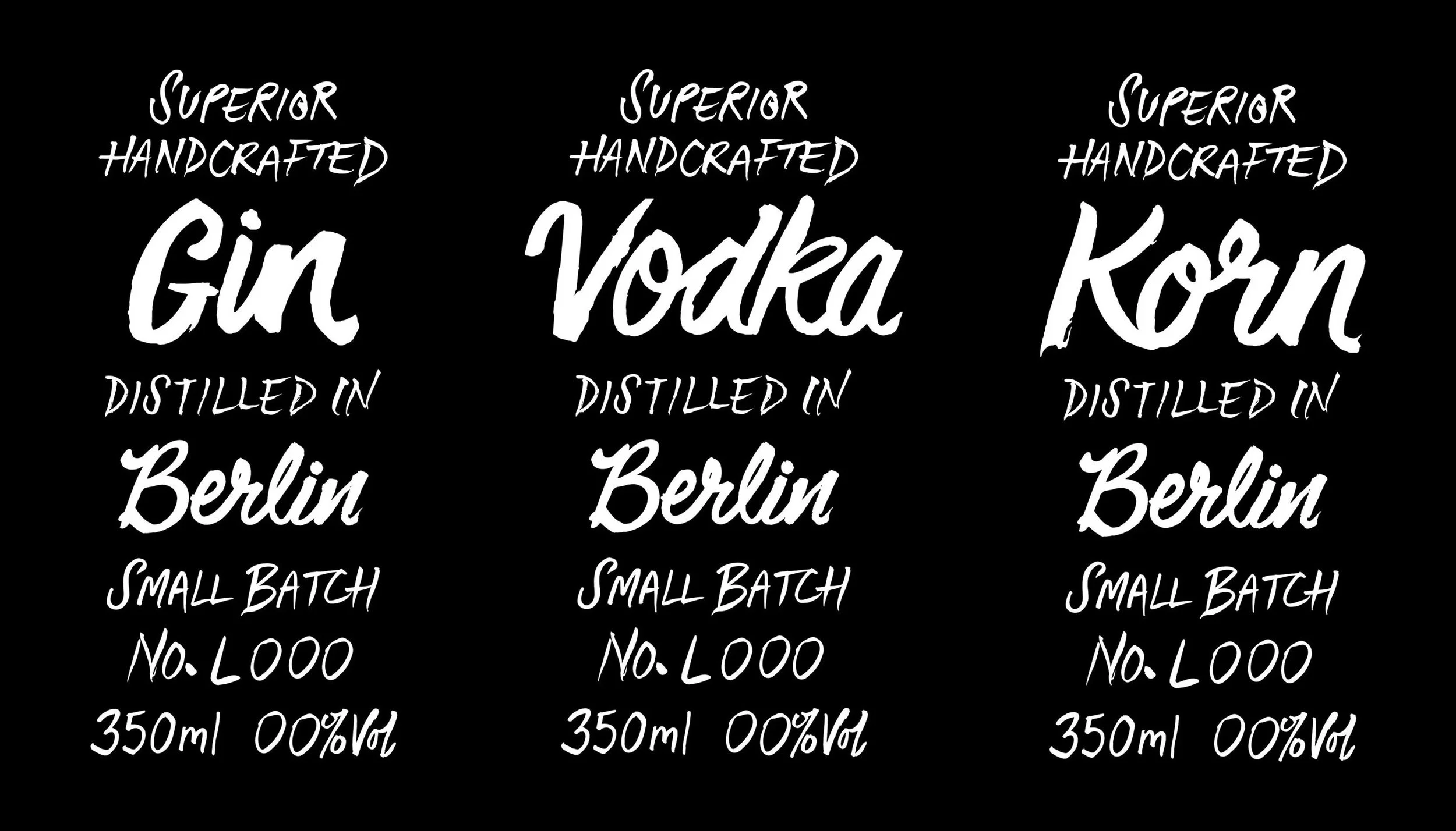
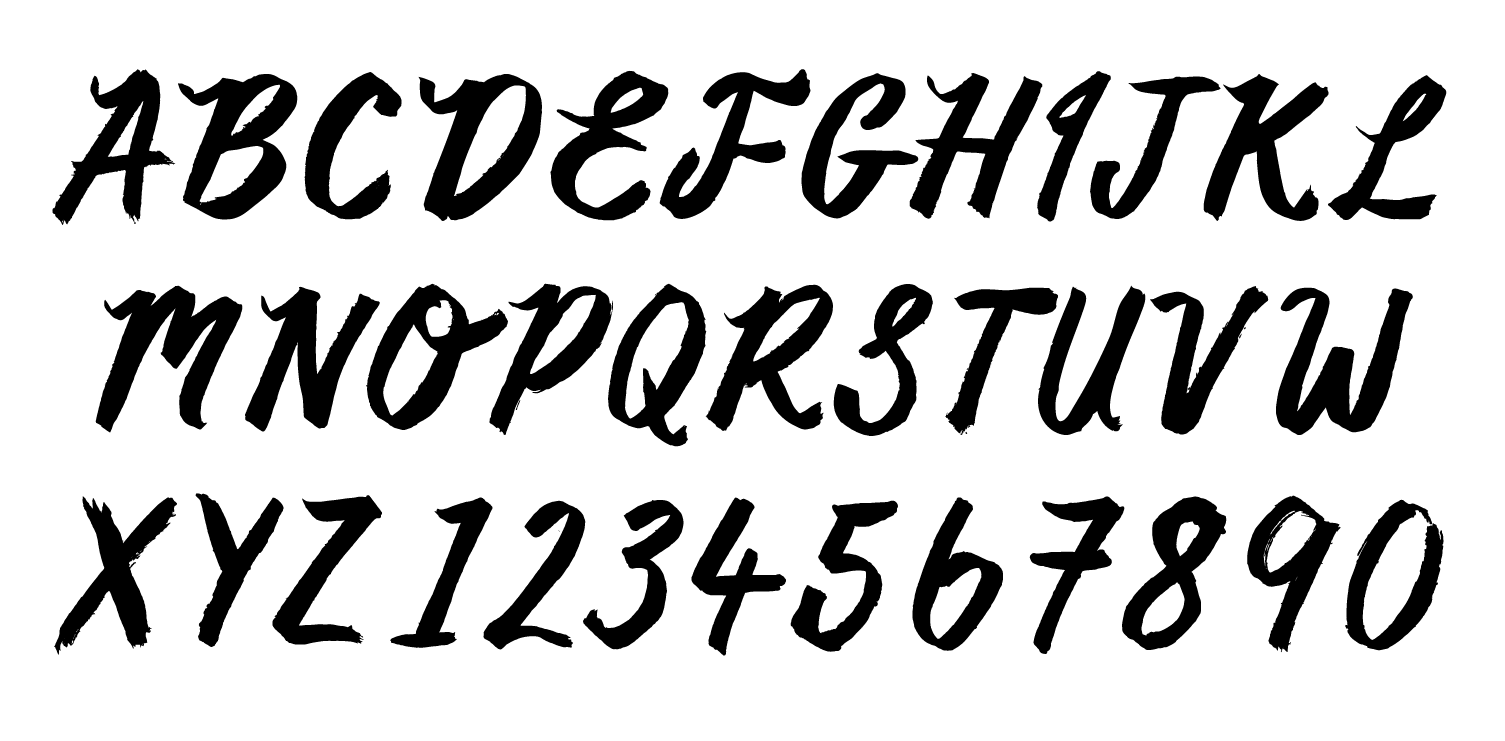
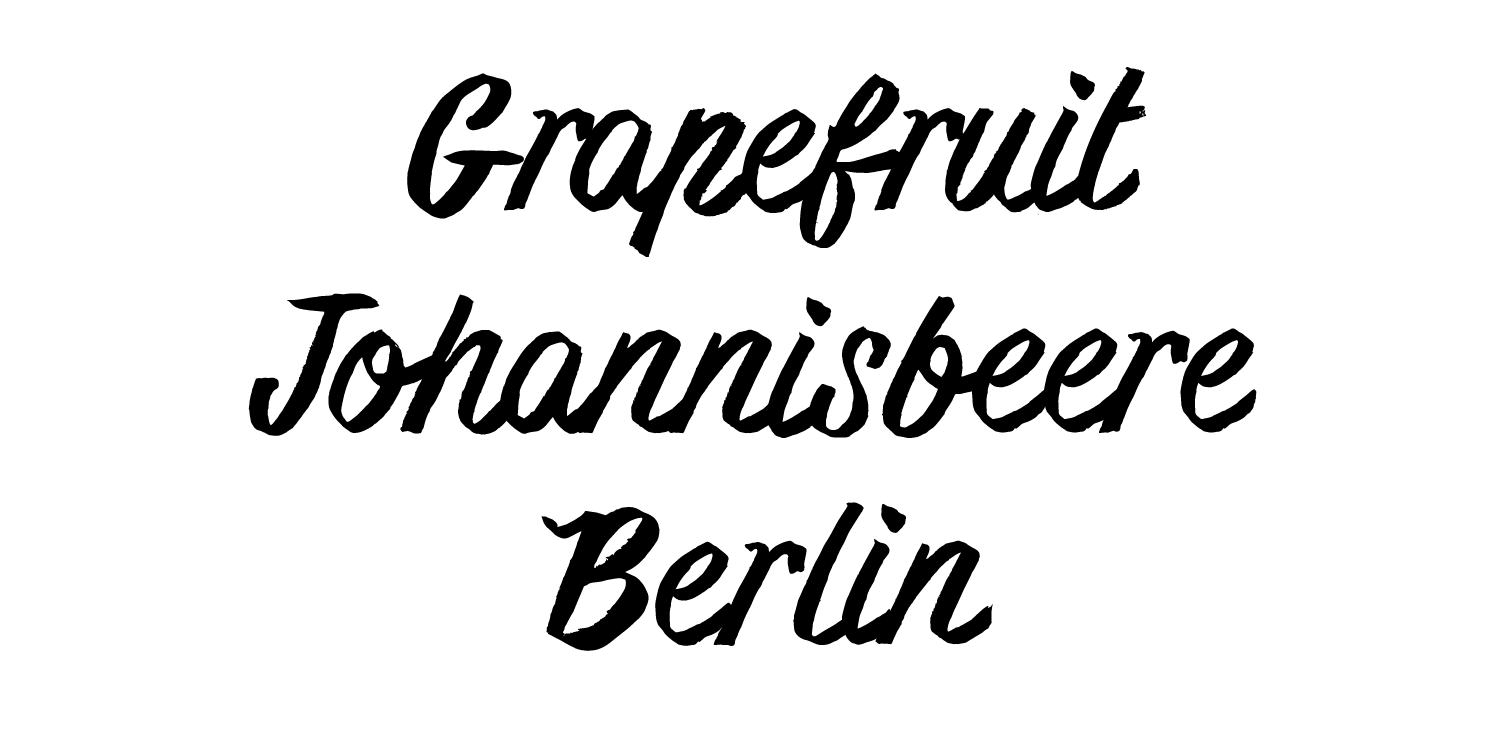
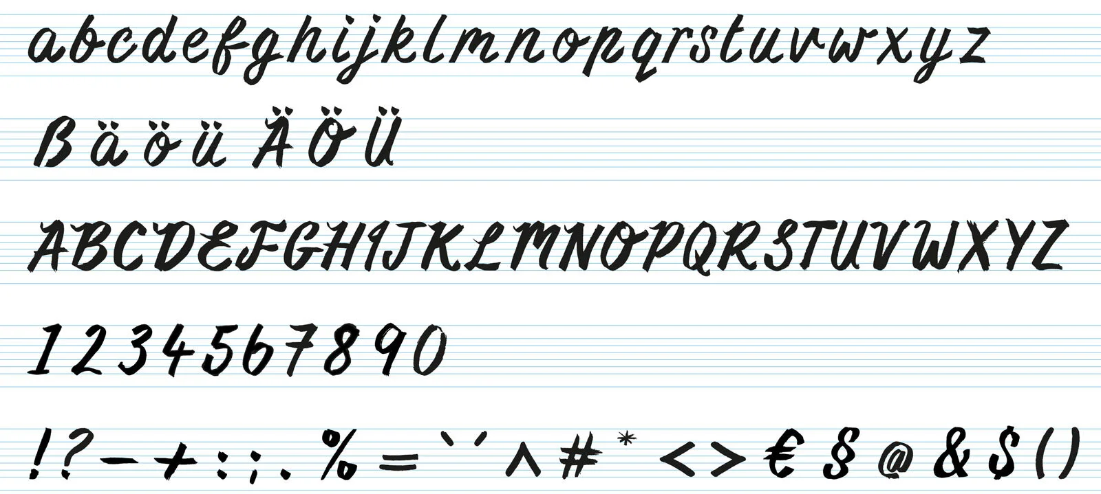
after the initial typographic treatment for the packaging was created i expanded the lettering into a full alphabet
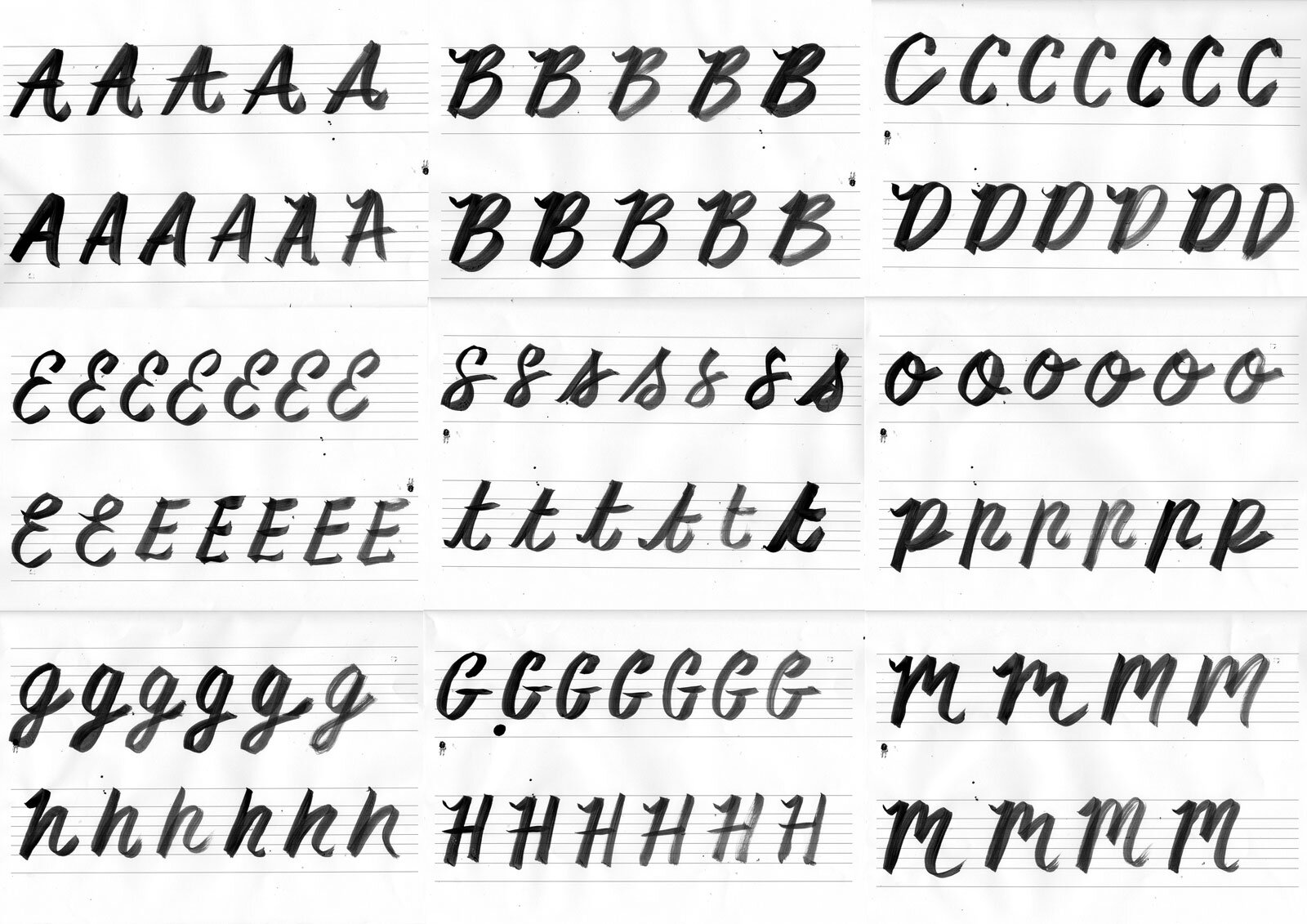
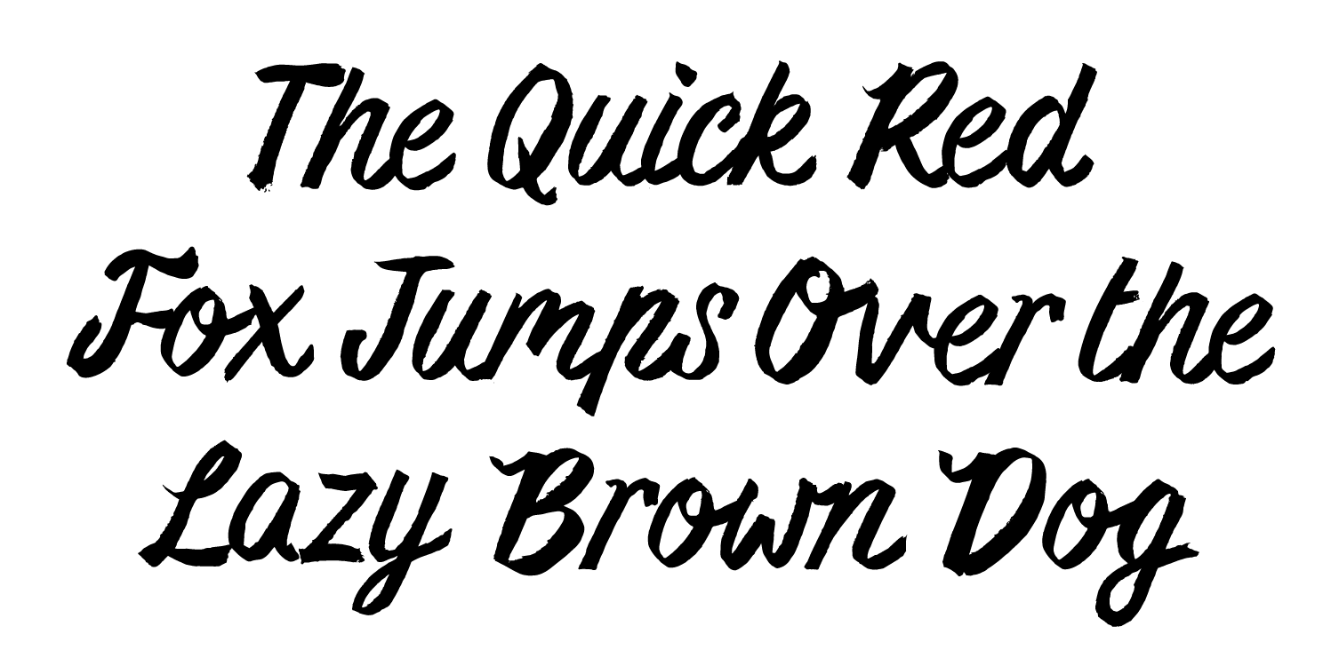
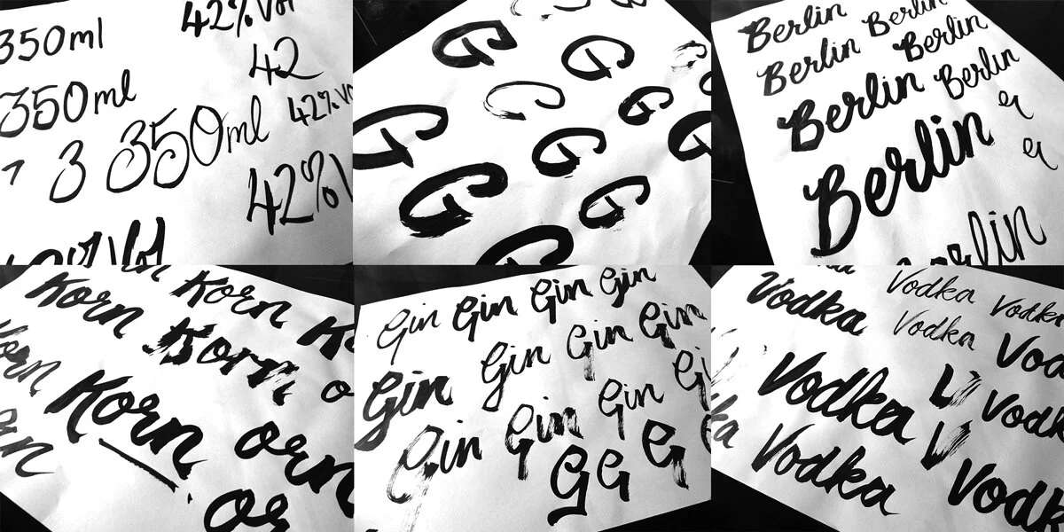
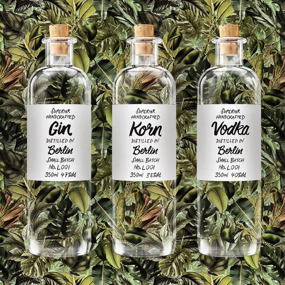
I’ve always favoured hand rendered when it comes to typography, its where truly unique solutions happen. For this packaging project for a Deutsche Spirituosen Manufaktur’s Superior Handcrafted range of products, I utilised indian ink and a variety of brushes, before digitally tidying up the letterforms.
Getting hands on and messy is one true way of ensuring really standout design work that can’t be replicated. The brush stroke you make on paper won’t be the same as the one that preceded it, or the one that comes after..