

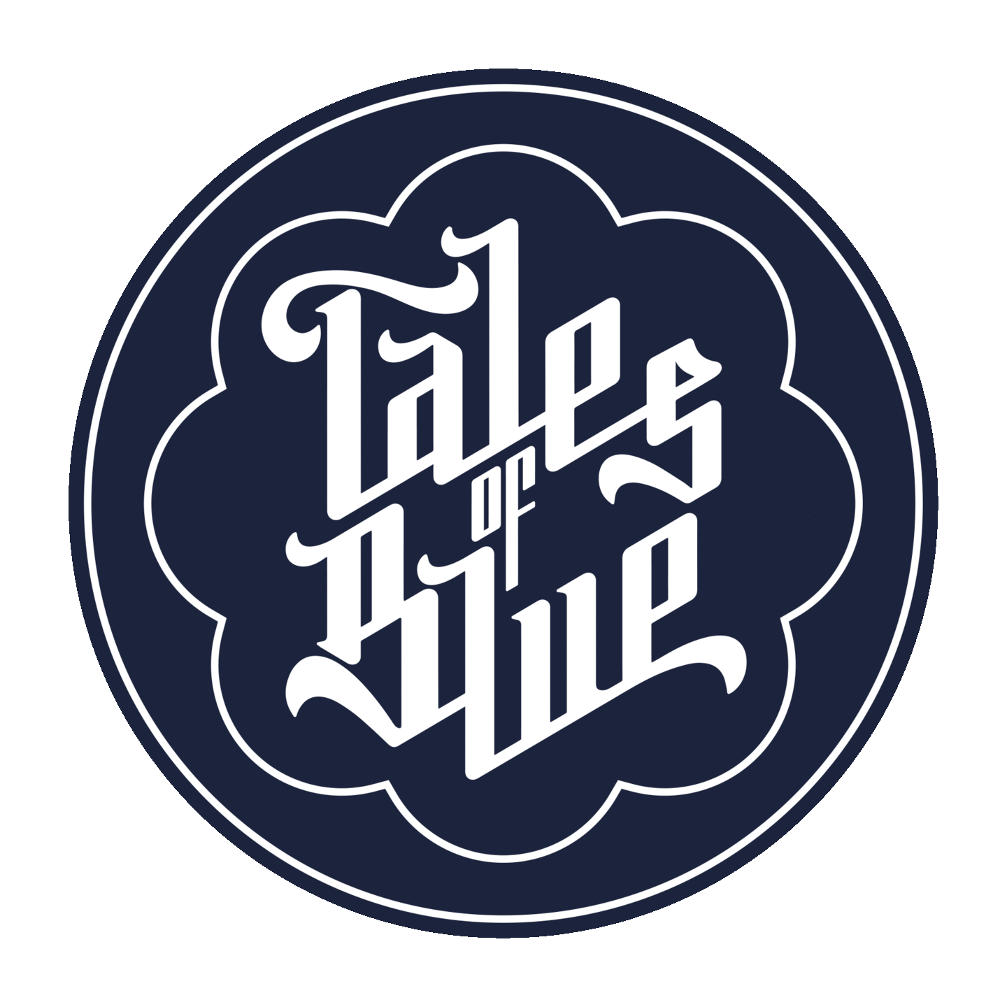
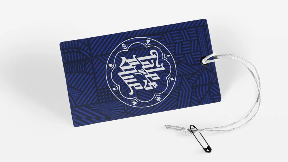
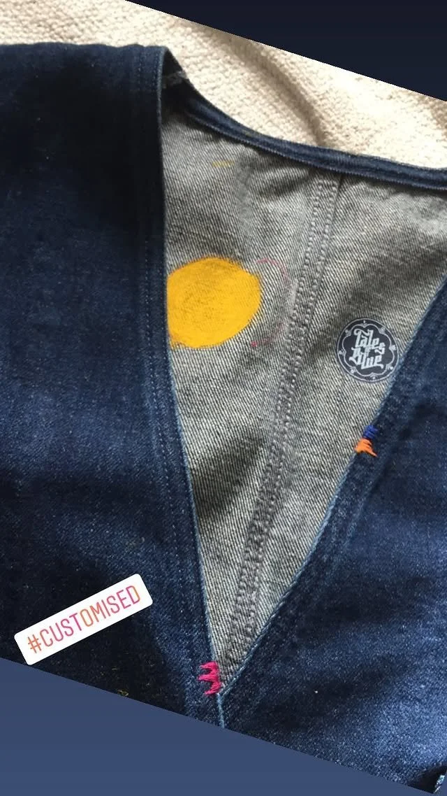
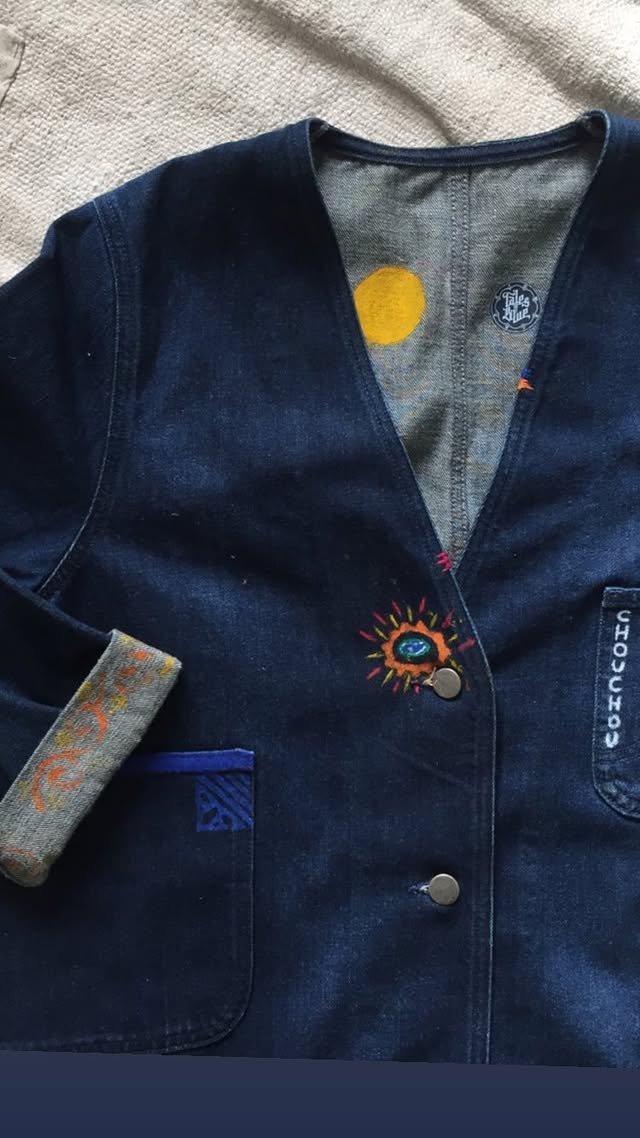
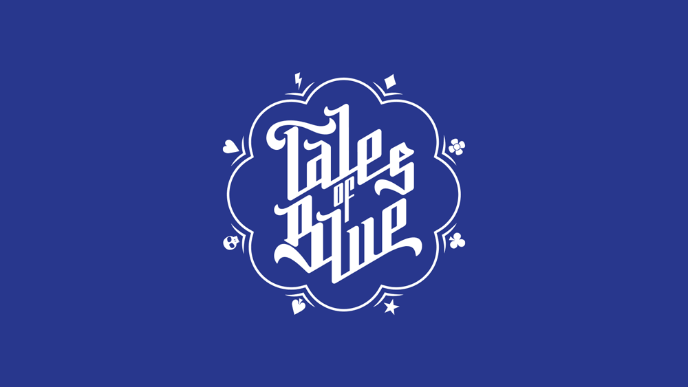
tales of blue
custom wordmark for an upcycling and vintage apparel company from Bruges

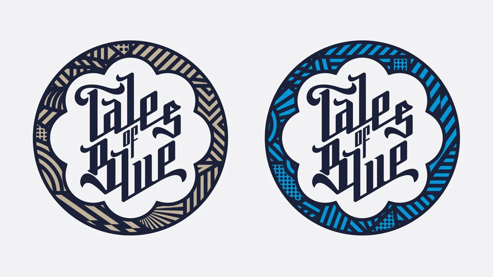
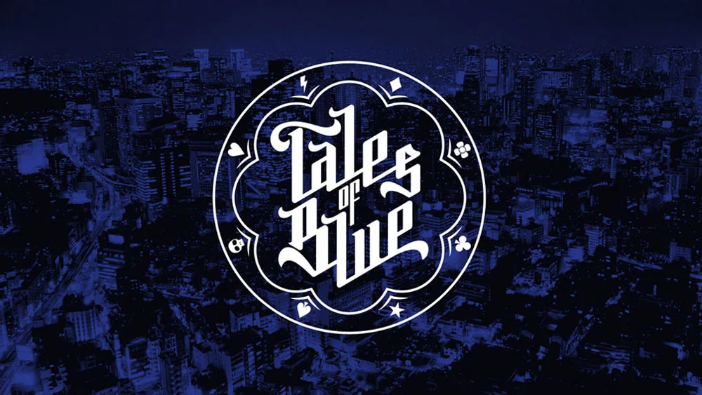
there were some other typographic explorations before settling on this design
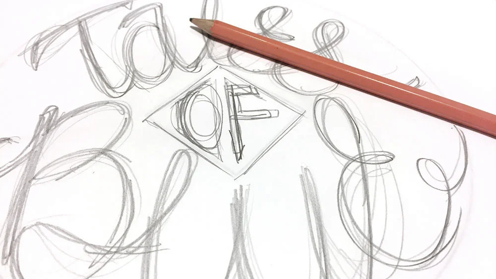
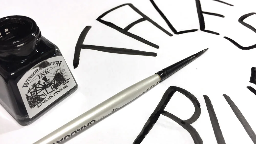
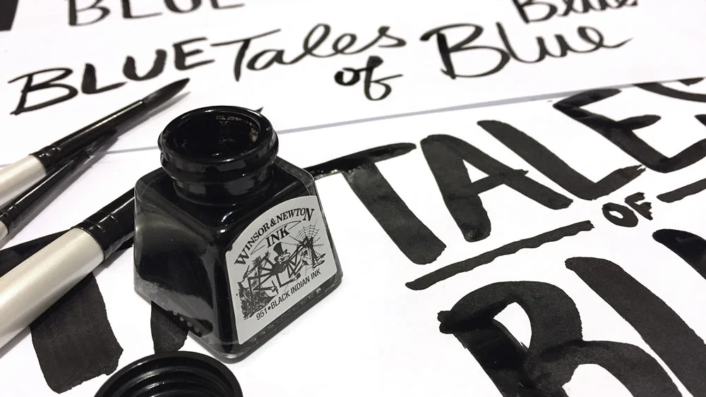
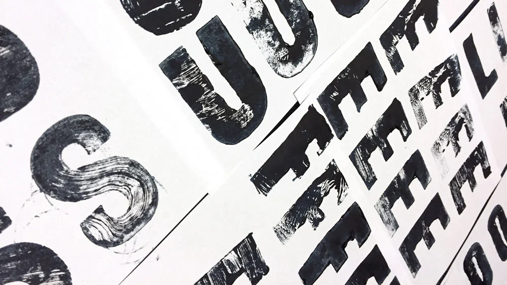
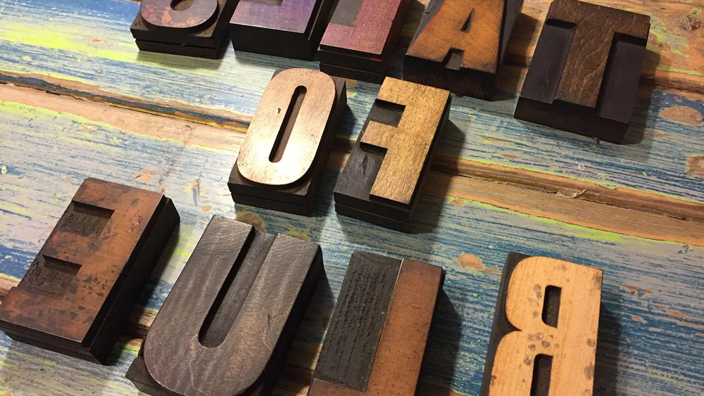
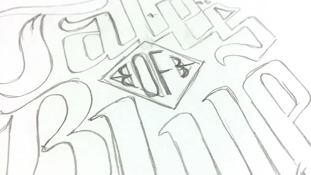
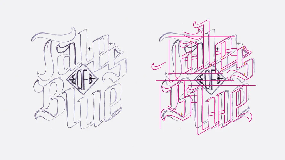
A reminder that inspiration can strike anywhere. I remember my initial idea for this logo revolved around printing with some old wooden letterpress blocks, I felt it would suit what the business did. But something felt off, the letters looked cool but just didn’t seem to fit the aesthetic of the brand. Some other experiments with pen, brush and ink also seemed a bit off. As i was researching another project I came across a calligraphy style that seemed perfect for this project, I drew my own version before refining digitally.