

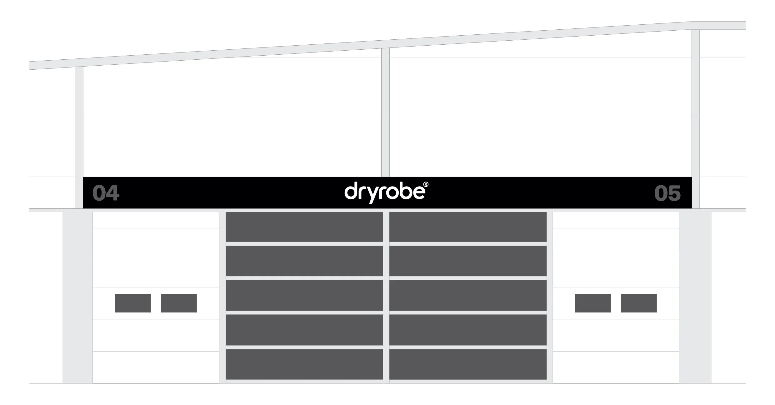
dryrobe®
refreshing and elevating one of the UK’s fastest growing SPorts apparel brands
Just for reference, this is what the old logo looked liked

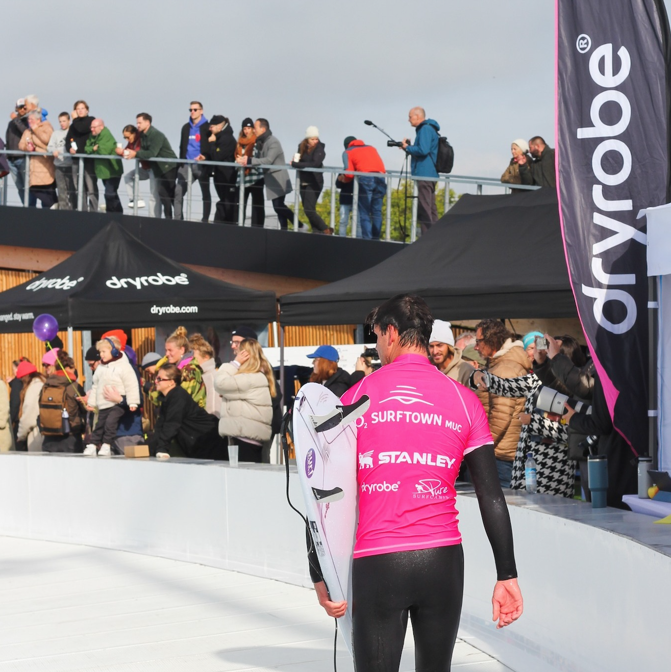
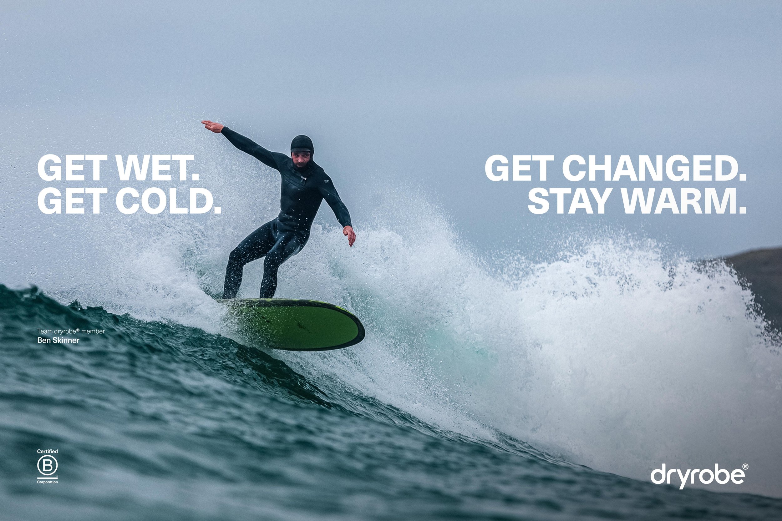
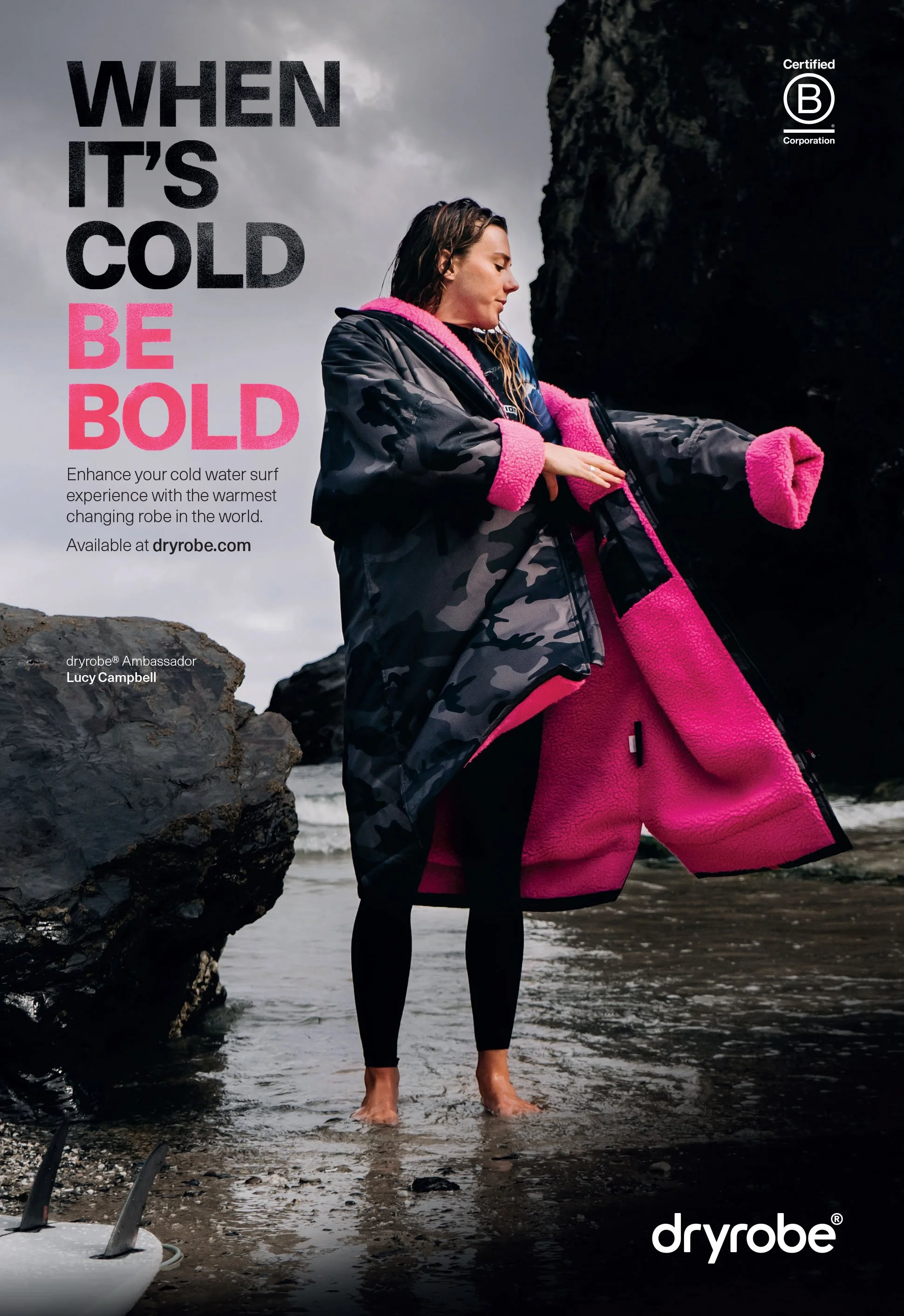
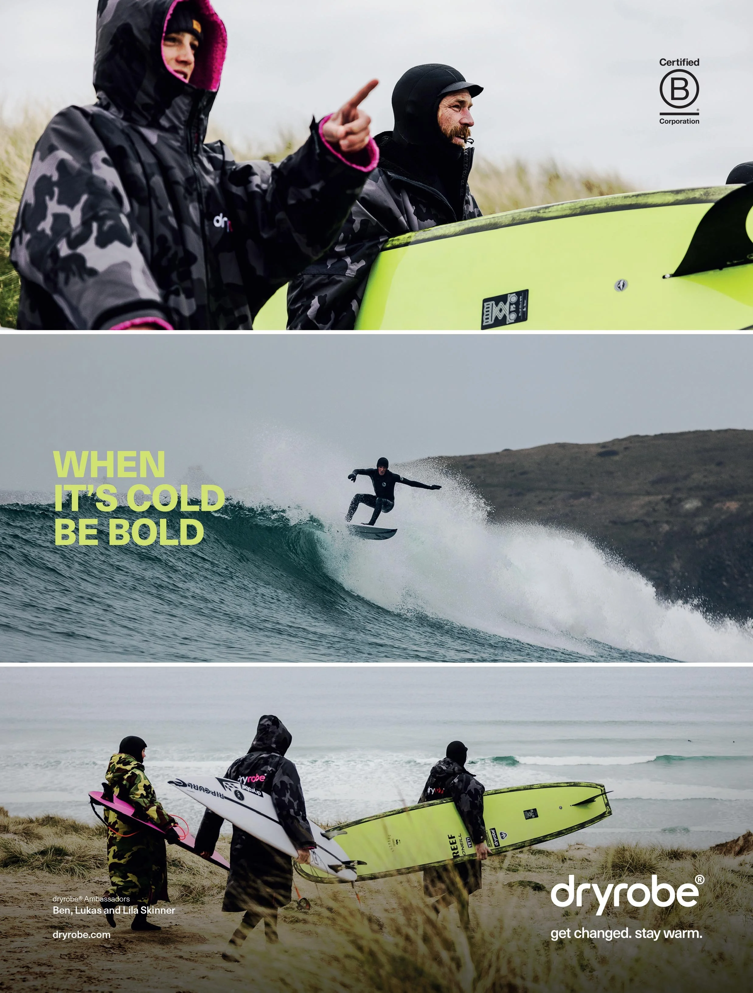
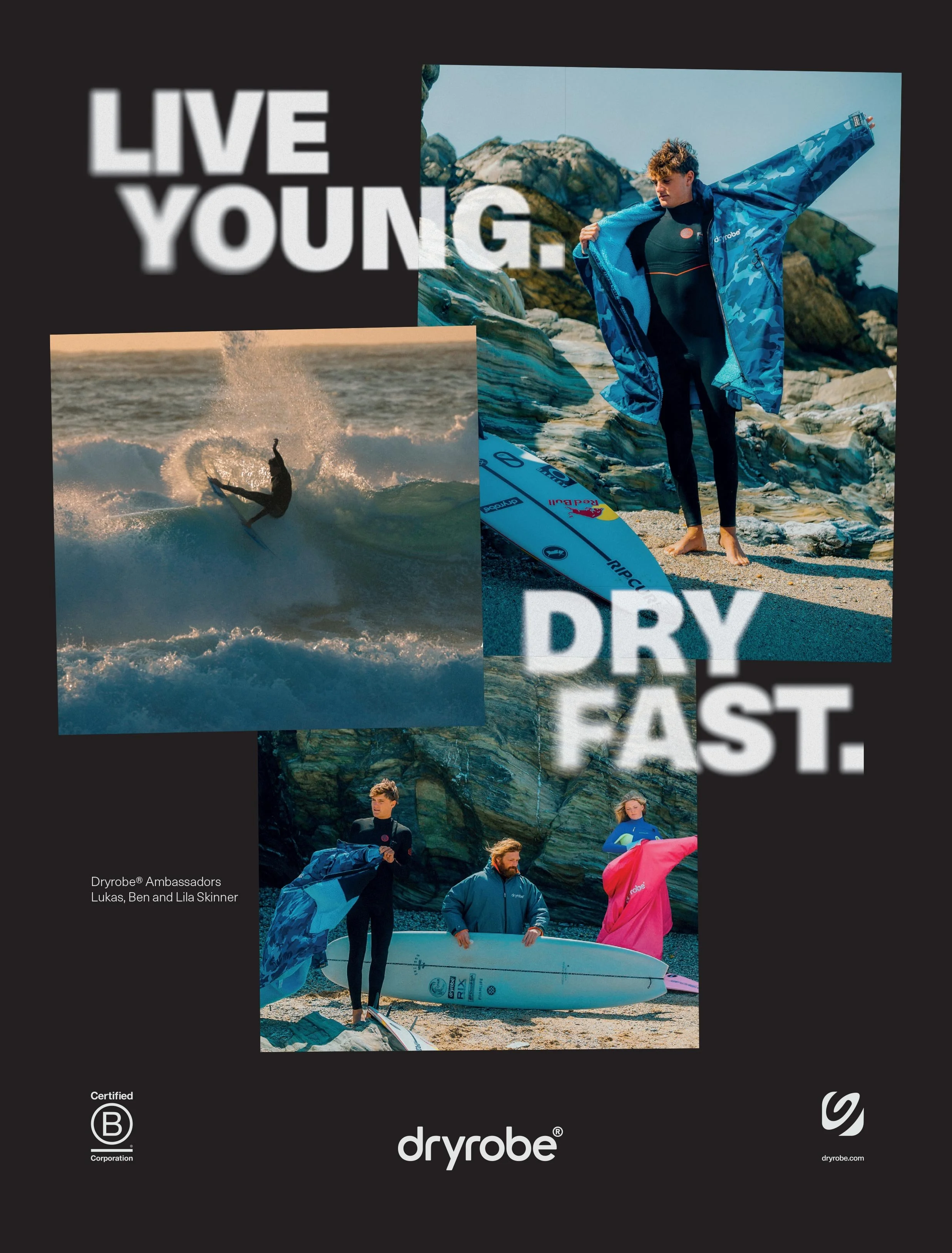
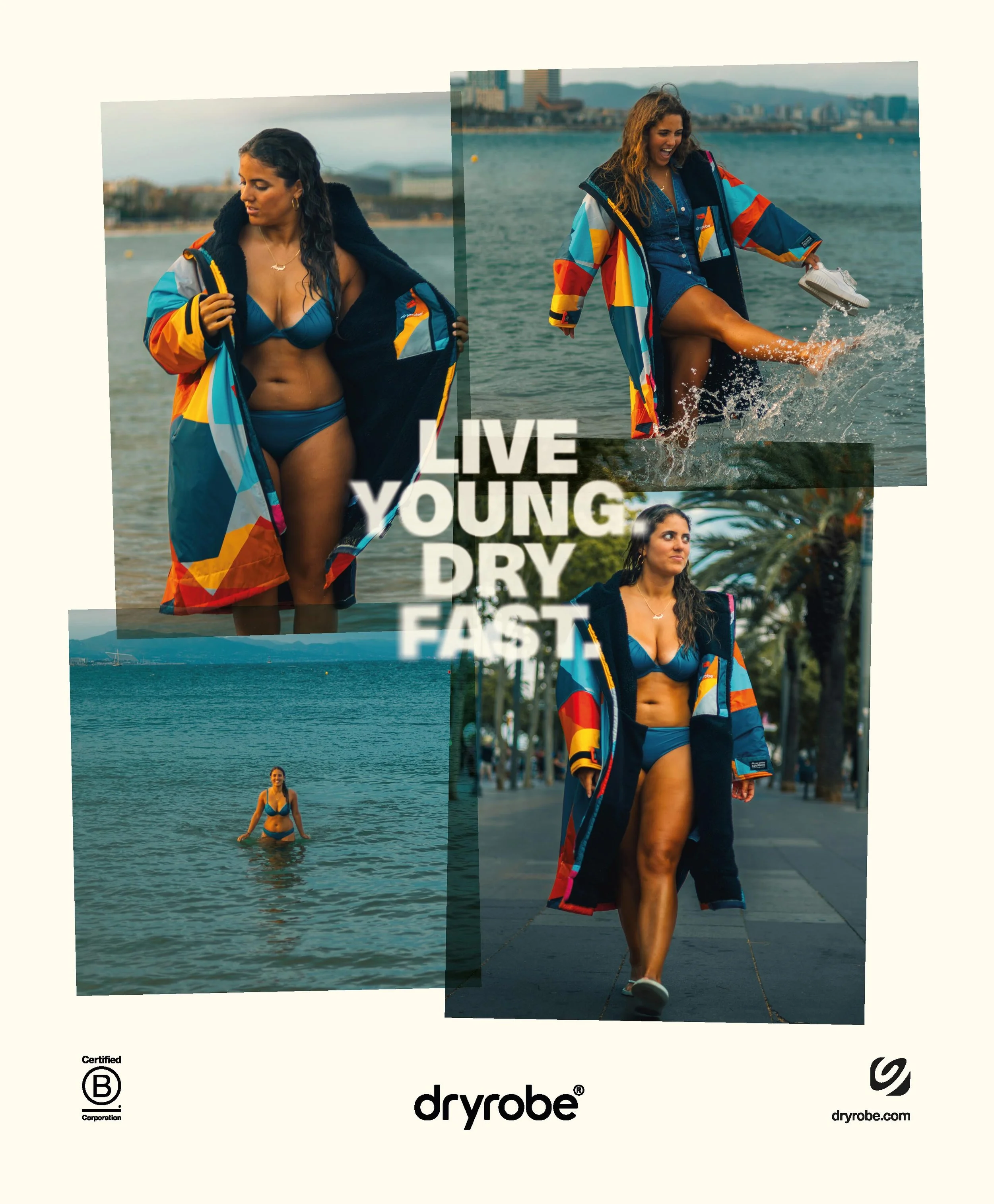
This is a very small section of work produced whilst working as Art Director at Dryrobe® between 2021 and 2025. For those that don’t know, Dryrobe® is a UK based apparel brand that invented the now ubiquitous changing robe seen on surfers, swimmers and adventurers up and down the country, warming them up after being in the water.
I joined the company at a time of real growth and a massively increasing audience, and as the brand was at this point about ten years old it seemed like a good opportunity for a visual refresh that was a better reflection of the business as it was in 2021, looking to future-proof the brand for the next ten years and beyond.
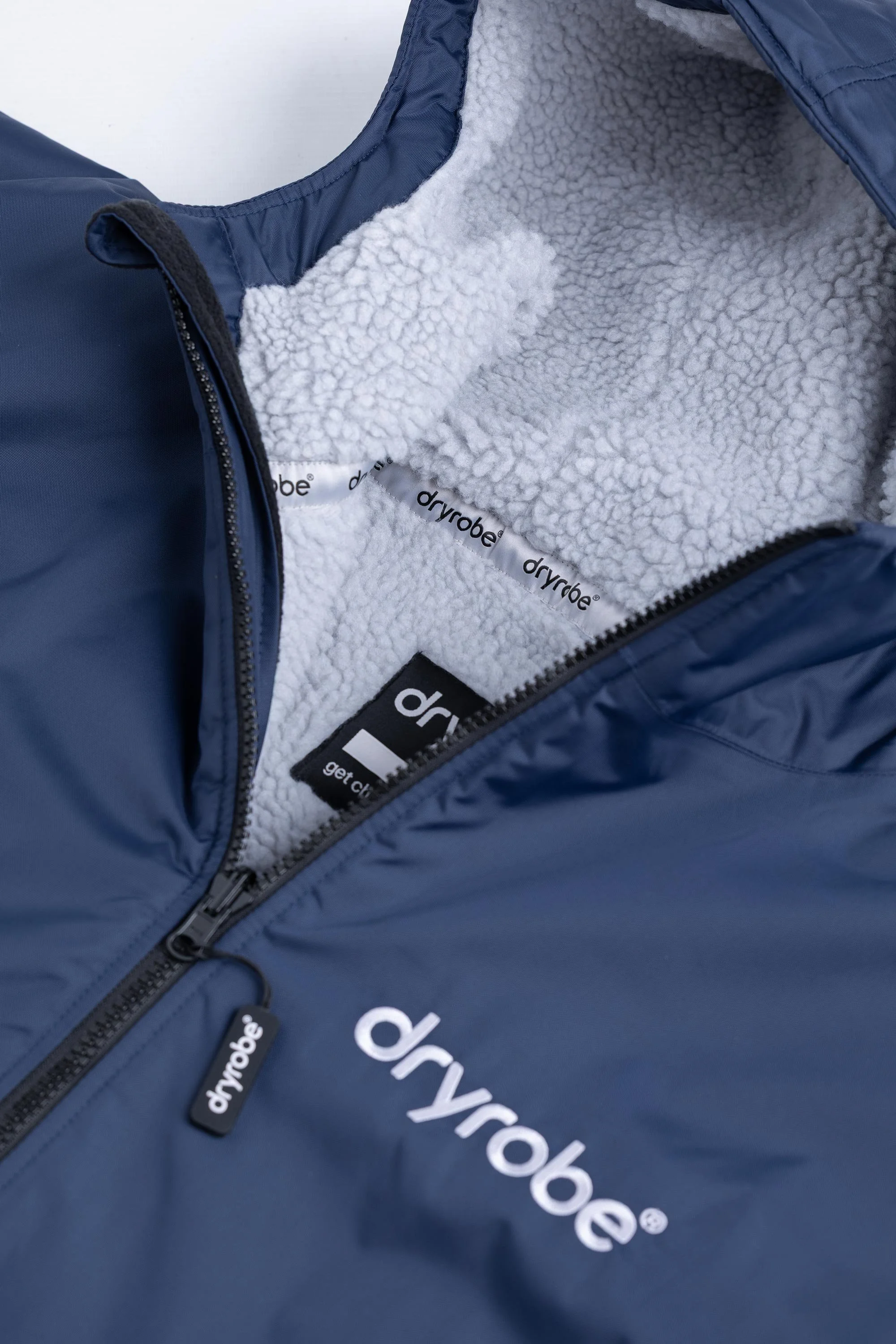
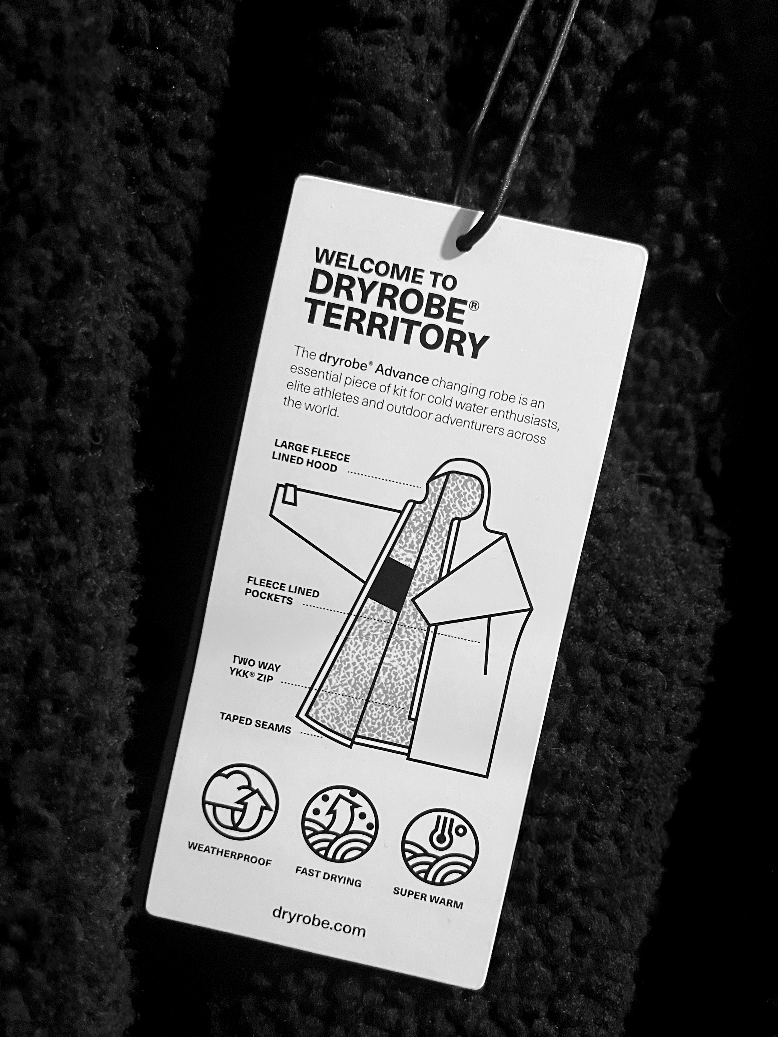
We decided to separate the logotype from the icon so the two could be used independently. The logotype is an entirely bespoke set of letters that we spent a long time crafting. Inspired by the streamlined nature of the product, we did away with fussy elements whilst also giving the letterforms a friendlier, warmer feel which again takes inspiration from the product. An important part of the process was to unify the word ‘dryrobe’ as the old logo was easy to misinterpret as ‘dry[space]robe’.
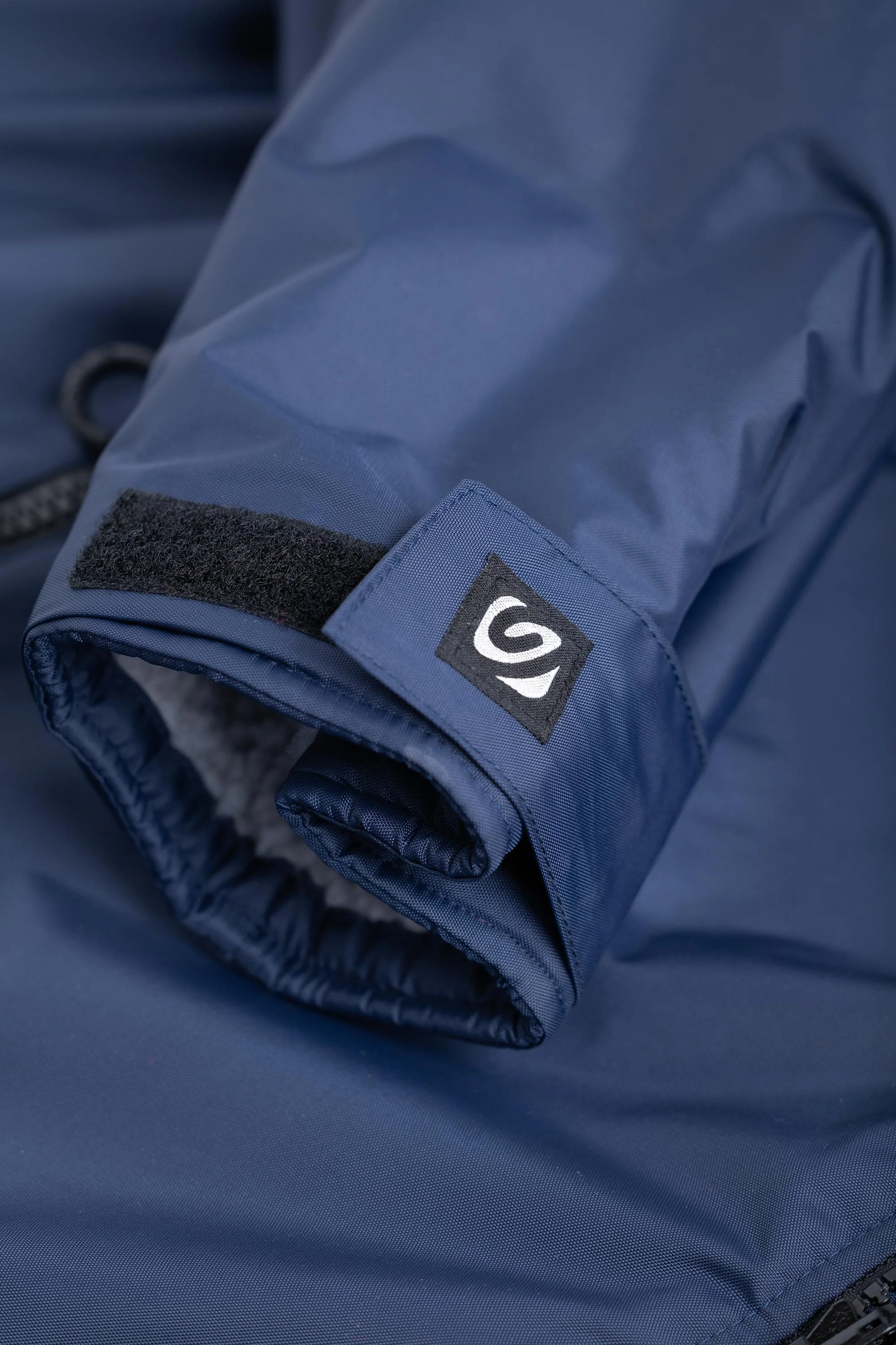
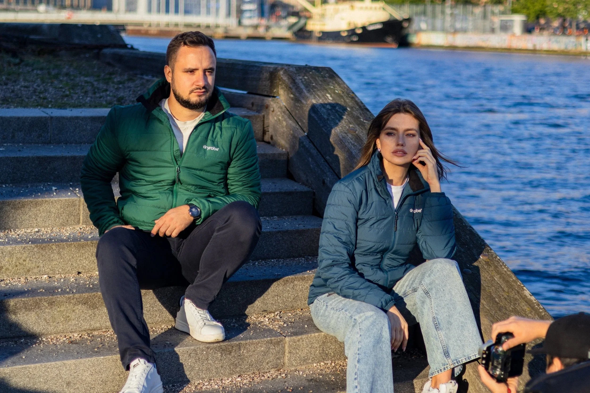
To work with the logo, we switched the corporate typeface from Helvetica to Neue Haas Unica and beefed up the icon set with thicker, simpler lines inspired by modernist Swiss graphic design, which is a timeless design style I absolutely love.